

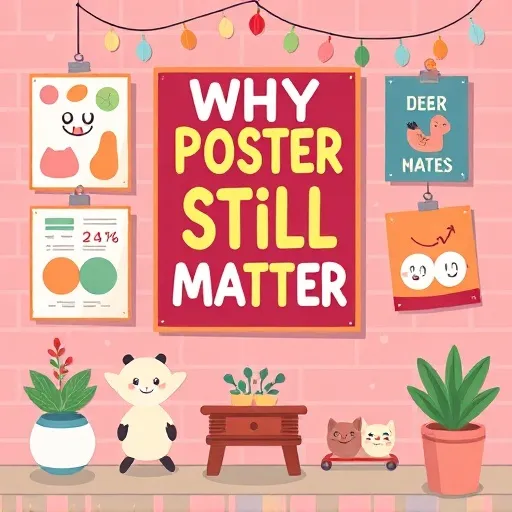
Physical media resur
Why Posters Still Matter in a Digital-First World
You might be thinking, "Isn't everything digital now?" Well, not quite. In fact, there's been a fascinating counter-trend happening in 2026. As more and more of our lives shift online, physical media has actually become more impactful. When someone walks past posters on a wall, it cuts through the noise in a way that digital ads simply can't. There's no ad blocker for a brick wall. There's no "skip" button on a street corner. That's the magic of print media — it lives in the real world, and it demands your attention whether you're ready or not.
Research in environmental psychology has consistently shown that physical objects create stronger memory anchors than digital impressions. When you touch something, see it in three-dimensional space, or walk past it repeatedly, your brain encodes that information differently. This is why posters remain a go-to tool for everyone from indie musicians to major event organizers to small business owners. A well-placed poster isn't just seen — it's experienced. The tactile experience of print design creates a lasting impression that a fleeting social media post just can't match.
Plus, with the rise of hybrid work environments and experiential retail, physical spaces are being reimagined. Posters are no longer just "advertising" — they're part of the atmosphere. They tell stories, set moods, and create identity. A well-designed poster on a wall says something about who you are and what you care about. It's visual storytelling at its finest, and it transforms blank walls into brand experiences that people actually remember.
The Attention Economy Meets Physical Space in Modern Marketing
In 2026, attention is the scarcest resource. Digital platforms are saturated. Social feeds are overloaded. But physical spaces? They're still relatively uncrowded from a messaging standpoint — at least compared to the chaos online. A poster in the right location can capture genuine, undivided attention in a way that a sponsored post simply can't. The attention economy has made physical advertising more valuable than ever, and smart marketers are catching on.
The key is understanding that posters aren't competing with other posters anymore. They're competing with everything — phone screens, conversations, daydreams. That means your graphic design has to be sharp, your message has to be clear, and your print execution has to be flawless. Every detail matters when you're fighting for someone's gaze in a world full of distractions.Artistree Live
Design Principles That Make Posters Pop: Bold Minimalism and Typography Trends
Let's get into the creative side. Design trends come and go, but some principles are timeless. That said, there are definitely some 2026-specific shifts worth paying attention to when creating posters that truly stand out.
Bold minimalism isn't new. But the version that's working right now is different from the sterile, white-space-heavy look of the past. Today's minimalism is bold. It's about massive typography, unexpected color combinations, and negative space used intentionally rather than just for the sake of being "clean." Think oversized headlines that take up 60% of the canvas. Think two-color palettes that clash in a way that feels deliberate. Think textures and grains that add depth to otherwise simple compositions. This approach works especially well for event posters, music promotions, and brand awareness campaigns.
In 2026, type is the design. Custom letterforms, variable fonts that stretch and morph, and hand-drawn scripts are all having a moment. If you're working with limited imagery or want to make a bold statement, let the words do the heavy lifting. Here are a few tips for making your posters unforgettable through typography:
- Contrast is everything. Pair a heavy display font with a light, clean sans-serif for body text.
- Hierarchy matters. Your viewer should know in half a second what the poster is about, who it's for, and what action to take.
- Don't be afraid of scale. Big type is memorable type. If your headline isn't readable from 10 feet away, it's too small.
Color Psychology and Visual Flow in Print Design
Colors trigger emotions faster than words. In 2026, we're seeing a lot of warm, earthy tones mixed with neon accents — a combination that feels both grounded and futuristic. Deep greens, burnt oranges, and electric blues are performing well across a range of contexts for posters. But here's the thing: color choices should always tie back to your message. A wellness brand might lean into soft, calming hues. A tech event might go for high-contrast, energetic combos. There's no one-size-fits-all answer, but there is a right answer for your specific goal.
How the eye moves across a poster determines whether your message lands. The classic Z-pattern still works for text-heavy designs. But for more visual posters, a central focal point with radiating elements can be more effective. Whatever layout you choose, make sure there's a clear entry point. Your viewer's eye needs a starting place. From there, guide them through the information in order of importance. Good visual hierarchy is what separates amateur posters from professional ones.Artistree Live
Printing Technologies and Eco-Friendly Materials for Modern Posters
The print industry hasn't been sitting still. In 2026, there are more options than ever for producing high-quality posters that stand out — literally and figuratively. Sustainability is no longer a niche concern. It's a mainstream expectation. Recycled papers, plant-based inks, and biodegradable coatings are now widely available and affordable.
Some popular eco-friendly printing options include recycled matte paper with a natural, uncoated feel, stone paper made from calcium carbonate that's waterproof and tear-resistant, and seed paper that can be planted after use — perfect for event giveaways. If your brand values align with environmental responsibility, choosing eco-friendly printing options for your posters isn't just good ethics — it's good marketing.
Digital printing has gotten incredibly sophisticated. Today's machines can produce razor-sharp details, vibrant gradients, and consistent colors across large runs. For smaller batches or one-off prints, digital is almost always the way to go. If you're printing posters in bulk, offset printing still offers cost advantages — but the gap is narrowing.
Want your poster to feel as good as it looks? Special finishes can elevate a design from "nice" to "unforgettable." Consider spot UV for a glossy coating applied to specific areas, foil stamping for metallic accents that catch the light, embossing and debossing for raised or recessed elements, or soft-touch lamination for a velvety finish. These finishes cost more, but for high-visibility pieces like limited-edition art prints or premium event posters, they're absolutely worth it.
Where and How to Display Posters for Maximum Impact
Great design means nothing if nobody sees it. Placement is just as important as the poster itself. Outdoor posters need to be weather-resistant and readable from a distance. Think bold colors, large text, and durable materials like vinyl or synthetic paper. Indoor posters can afford to be more detailed and subtle, since viewers are typically closer and more willing to spend time reading.
Eye level is the sweet spot. This sounds obvious, but you'd be surprised how many posters end up too high or too low. The center of your poster should sit at roughly eye level for the average viewer — around 5 to 5.5 feet off the ground. Lighting makes or breaks a poster too. A beautiful poster in bad lighting looks like a mistake. Make sure your display area has adequate, even illumination.
One of the most exciting trends in 2026 is the integration of physical posters with digital experiences. QR codes can link a printed poster to an interactive landing page, augmented reality experience, or exclusive content. This bridges the gap between the tangible and the digital, giving viewers a reason to engage beyond just looking. Just make sure the digital destination is worth the effort — if someone scans your code and lands on a broken page, you've wasted a golden opportunity.Artistree Live
Common Mistakes to Avoid When Designing and Printing Posters
Even experienced designers and marketers make these errors when creating posters. Here's what to watch out for:
- Too much information. A poster is not a brochure. Stick to one core message and one clear call to action.
- Low-resolution images. Print requires much higher resolution than screen. Always use 300 DPI or higher for raster images in your posters.
- Ignoring the bleed and margin. Printers need a little extra space around the edges. If you don't account for bleed, your design might get cropped awkwardly.
- Poor color management. What looks vibrant on your monitor might print dull or off-tone. Always work in CMYK for print and request a proof if possible.
- No clear focal point. If everything is emphasized, nothing is emphasized. Pick a hero element and build around it.
Posters as Part of a Broader Marketing Strategy
Posters don't exist in a vacuum. They work best when they're part of a coordinated campaign that spans multiple channels. A poster can drive people to a website, promote an event, build brand recognition, or create a sense of place. But it should always connect to something larger. Think about how your poster fits into the customer journey. Is it the first touchpoint? A reminder? A reinforcement of an existing message? The answer will shape everything from the design to the copy to the placement.
How do you know if your poster worked? Unlike digital ads, you can't track clicks in the traditional sense. But you can measure impact through QR code scans and unique landing page visits, promo codes specific to the poster campaign, foot traffic increases in the display area, social media mentions featuring the poster, and event attendance spikes following the poster run. Set clear goals before you print your posters. Without a benchmark, you'll never know if your poster was a triumph or a flop.
The Future of Posters: Smart Materials and Hyper-Local Personalization
Looking ahead, posters are only going to get more interesting. We're already seeing experimentation with smart materials — posters that change color based on temperature, or that incorporate conductive inks to create interactive surfaces. Augmented reality is becoming more seamless, allowing a simple printed image to trigger rich digital overlays. Personalization is another big frontier. Short-run digital printing makes it feasible to create small batches of posters tailored to specific neighborhoods, events, or even individual recipients. This kind of hyper-local, hyper-relevant messaging is incredibly powerful for brand awareness.
And of course, sustainability will continue to drive innovation in materials and processes. The posters of tomorrow will be kinder to the planet and more striking than ever. Posters are simple in concept but complex in execution. Getting them right requires a blend of creative vision, technical knowledge, and strategic thinking. But when everything comes together — the graphic design, the print, the placement, the message — a poster can do something that few other mediums can: it can stop someone in their tracks and leave a lasting impression. Whether you're promoting a local event, launching a new product, or simply trying to make your space look amazing, don't underestimate the power of well-crafted posters. In 2026, it's not just a piece of paper on a wall. It's a statement, a conversation starter, and sometimes, a work of art.